Light draws the eye and increases stop-and-notice rates
People are hard-wired to notice contrast and luminance. A properly illuminated sign creates a bright, legible focal point that “pops” against the streetscape and competing visual noise. Eye-tracking studies in retail environments shows that well-placed, well-lit signage measurably increases visual attention and influences navigation and purchase intent.[1], [2], [3]
First impressions - lighting communicates quality before you say a word
Exterior signage is often the very first branded touchpoint. Research on the economic value of on-premise signage finds that improvements to visibility and readability correlate with higher traffic and sales across categories—from hospitality to financial services to automotive.[4], [5], [6]
Translation: crisp, evenly lit letters and faces signal professionalism and trust. Dim, blotchy, or color-shifted lighting does the opposite.
Compete and win in crowded commercial corridors
In saturated retail corridors, the brands that control contrast and legibility win attention. Consistent illumination helps your mark stand out in glazing reflections, vehicle headlights, and LED clutter. Studies show signage functions as a “silent salesperson,” aiding wayfinding and supporting brand recall—especially when visible in low-light conditions when traffic volumes can still be high.[4], [6]
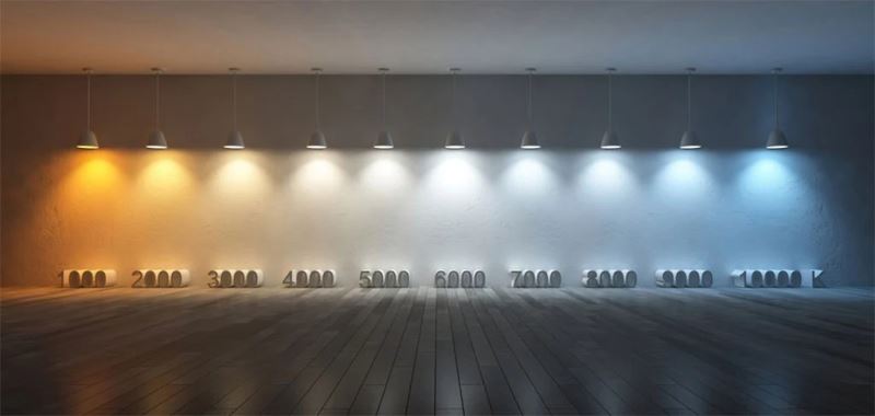
Kelvin (CCT) matters - brighter look vs. richer look
“Kelvin” (more precisely, correlated color temperature or CCT) describes the apparent color of white light—from warm (˜2700–3500K) to neutral (˜4000–5000K) to cool (˜5700–6500K+). Cool-neutral whites are generally perceived as crisper and can look brighter at the same measured luminance, thanks to how our vision shifts under low light (mesopic conditions). Warmer whites can make brand colors feel richer and more premium.[7], [8], [9]
| CCT (Kelvin) | Perceived Effect | Best For |
|---|---|---|
| 3000–3500K | Warm, inviting; richer reds/oranges; premium feel | Hospitality, dining, brands with warm palettes |
| 4000–5000K | Neutral, “white” white; excellent readability; balanced brightness & color | Most retail & professional services; mixed palettes |
| 5700–6500K | Cool, crisp; highest apparent brightness; clinical/techy vibe | Tech, clinics, high-contrast logos; high-glare corridors |
Tip: match your sign’s Kelvin to interior lighting so the experience feels cohesive. Always verify CRI (color rendering) along with CCT so brand colors don’t wash out.
What “good” lighting looks like on a sign
- Uniform face brightness (no hot spots), with diffuser materials such as vinyl graphics or other overlays.
- Correct CCT for brand and context; neutral 4000–5000K is a safe starting point for readability in many signs.
- Adequate nit/foot-lambert levels for viewing distance and ambient light—bright enough to pop, dimmable enough to meet local code at night.
- High CRI LED modules (typically 80–90+), so color stays true.
- Quality drivers with proper thermal management to prevent color shift and early lumen depreciation.
Why Dallas–Fort Worth businesses choose Signs Manufacturing™
In the DFW metroplex, Signs Manufacturing™ leads with an obsessive focus on lighting details that most shops overlook. For each project, our team:
- Recommends CCT by brand palette and streetscape (e.g., 4000–4500K for crisp readability; 5000–6000K for maximum punch; 3000–3500K for warm hospitality).
- Specifies LED module density, optics, and driver pairing to eliminate zebra striping and blotchiness on faces.
- Uses photometric targeting for legibility at the farthest expected viewing lane—then adds nighttime dimming profiles to stay compliant and comfortable.
- Validates CRI and bin consistency across replacement modules so your sign looks the same year after year.
The result is the look customers remember: clean, even, and unmistakably you. That’s how a lighted sign turns impressions into visits—and visits into sales.[4], [5]
What does it all mean?
If you’re opening, rebranding, or simply under-lit, prioritize the sign. Choose a layout that telegraphs who you are + what you offer, then pair it with the right Kelvin, modules, and drivers. You’ll gain attention, polish your first impression, and out-compete nearby storefronts—day and night.
Sources & Further Reading
- Otterbring, T. et al., “Vision (im)possible? The effects of in-store signage on customer attention and decision making,” Journal of Retailing and Consumer Services (2014). Link
- “Seeking attention: An eye-tracking study of in-store merchandise displays,” (open abstract/summary). Link
- Neurons Inc. x Lowe’s case on signage and navigation (mobile eye-tracking). Link
- The Economic Value of On-Premise Signage, Sign Research Foundation (University of Cincinnati, 2012). PDF | Overview: Link
- The Economic Values of On-Premise Signs, R.T. Anderson (Signage Foundation). PDF
- ISA: “Economic Impact of Signs & Sign Regulations” (industry research roundup). Link
- FHWA primer on CCT (Kelvin) and appearance. Link
- Smet, K. et al., “Recommended Method for Determining CCT,” LEUKOS (2023). U.S. DOE copy. Link
- Kazemi, R. et al., “Comparing task performance, visual comfort and alertness under different CCTs,” Journal of Circadian Rhythms (2018). Link
- Albunayah, R., “Perceived Brightness of Colored Light” (2023) — perception varies with CCT even at equal luminance. PDF
Need help picking the right Kelvin, modules, and drivers for your storefront? Signs Manufacturing™ can audit your location and provide side-by-side night photos and mockups so you can see the difference before you commit.