Why the Human Eye Doesn’t See Greens and Blues Very Well, and Why It Matters for Business Sign Design
When designing or purchasing a business sign, most people focus on the name, logo, and overall style. But one of the most critical, and often overlooked, factors is color visibility. Not all colors are created equal when it comes to how the human eye perceives them, especially at a distance.
In particular, blue and green are among the hardest colors for the human eye to see clearly, especially in low light or from far away. This has major implications for how effective your sign will be at catching attention and communicating your brand.
Let’s break down why this happens — and how to design smarter, more visible signs because of it.
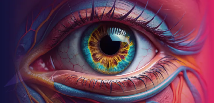
1. How the Human Eye Sees Color
The human eye detects light and color through two main types of photoreceptors in the retina:
- Rods, which are sensitive to light and motion but not color. They dominate our vision in dim light or at night.
- Cones, which detect color and function best in bright light. There are three types of cones:
- L-cones (long wavelength): Most sensitive to red and orange light.
- M-cones (medium wavelength): Most sensitive to green light.
- S-cones (short wavelength): Most sensitive to blue light.
But here’s the key: these cones are not evenly distributed in the retina. About 64% of cones are L-cones (reds), 32% are M-cones (greens), and only around 2–4% are S-cones (blues). This means our eyes are physically less capable of seeing blue light sharply.
2. Why Blue and Green Are Hard to See
- Low cone density for blue: Because there are so few S-cones, blue doesn’t register as sharply or brightly as other colors.
- Refractive focus issues: Blue light scatters more and focuses slightly in front of the retina, causing a mild blur, especially in dim light or at a distance.
- Rod dominance in low light: At night or in the evening, rods take over, and they don’t detect color at all. Under these conditions, blue and green essentially wash out, while warm colors like red and yellow remain more noticeable.
- Background blending: Blue and green often occur in nature, think sky, trees, and landscaping. Because of this, they blend more easily into the environment than bright warm colors, reducing contrast and visibility.
3. Why This Matters for Sign Design
- Lower visibility at distance: A blue or green sign will usually be harder to read from far away than a red, white, or yellow sign (even if they’re the same size).
- Nighttime performance drops: Blue and green lettering can almost disappear at dusk or under artificial lighting, while warmer colors maintain much of their brightness.
- Contrast matters more: For blue and green to be visible, they need very high contrast backgrounds (such as white or black). Even then, they’ll rarely outperform warm colors in legibility.
- Branding vs. function: Many businesses love blue and green because they feel “calming” or “trustworthy”, and that can work well for interior branding or digital screens. But when used on outdoor signage, they can unintentionally make your business harder to find.
4. Real-World Examples
- Gas stations and banks often use green or blue logos but outline them in bright white or yellow for maximum contrast and visibility.
- Emergency vehicles and road signs almost never rely on blue or green alone for critical information. Stop signs are red and white for a reason, the eye catches them faster.
- LED displays using pure blue text often appear faint or fuzzy, especially in daylight, while red LEDs remain crisp and bright.
5. Smart Strategies for Better Sign Visibility
- Use contrasting backgrounds. For example, white lettering on a dark blue background or green lettering outlined in white.
- Consider outlines, shadows, or borders to make letters pop.
- Avoid blue text on black backgrounds — it’s one of the least readable combinations, especially at night.
- Use warmer colors for critical information (like your business name or call-to-action) and cooler colors for accents or logos.
- Make sure your sign lighting is strong and uniform if you’re using blue or green.
6. The Bottom Line
Your business sign isn’t just decoration ... it’s a communication tool. If customers can’t see or read it easily, it’s not doing its job.
Because the human eye is naturally less sensitive to blue and green, these colors are less effective for primary lettering or critical elements on outdoor signs. By understanding how human vision works, you can design signs that stand out, perform better at night, and pull in more customers.
If you’re investing in a sign, especially one meant to bring in drive-by traffic, color choice can make or break your visibility. A well-designed, high-contrast sign can mean the difference between being overlooked and being noticed.
Here's the Key Takeaway:
- Warm colors like red, yellow, and white are more visible and legible.
- Cool colors like blue and green require careful contrast and lighting.
- Better visibility means more traffic, more brand recognition, and more customers.
References / Further Reading
Enjoy this article? Share it:
Share on Facebook |
Share on X
Learn more about Signs Manufacturing, a commercial sign company


FOR ORDERING OR ASSISTANCE CALL:
214-339-2227 254-582-7446 817-861-1234 903-561-5959 940-365-3433 972-850-3300


Signs Manufacturing & Maintenance Corp.
4610 Mint Way, Dallas, Texas75236, US
214-339-2227 |
sales@signsmanufacturing.com
Business hours are 07.00 a.m. to 5.00 p.m. Monday thru Friday (Central Time)
or by Appointment
Emergency Service Available 24/7
Office hours are 08.00 a.m. to 5.00 p.m. Monday thru Friday
Showroom hours are by Appointment
Factory Tours by Appointment
TV Studio Tours by Appointment

Rated 4.4 / 5 based on 125 Google® reviews.
Privacy Policy
Copyright© 1979-2026 Signs Manufacturing
Corporation - ALL RIGHTS RESERVED